Social Discovery · UX Challenge · 2025 · Concept
Product Designer · UX Challenge
Mercado Livre.
meli play.
Streaming on Mercado Play is a solitary act — you search alone and you watch alone. Meli Play makes discovery something your friends do with you, and watching something you do together.
¶ Snapshot
Client
Mercado Livre
Year
2025
Role
Product Designer · UX Challenge
Duration
Self-directed challenge
Team
Solo
Platform
Mobile · Mercado Play, inside the Mercado Livre app
Status
Concept
Scope
Product Design · Benchmarking · Prototyping
My contribution
A self-directed UX challenge, end to end: framing the retention problem, running the benchmarks, sketching the two screens on paper, and prototyping the hi-fi flow in Figma.
¶ Problem
What was broken
Context
Mercado Play needed to optimise its user experience to strengthen engagement and reverse a drop in retention. The brief was to make the platform more social, intuitive and integrated — so that recommendations from friends and family are easy to reach and actually valued.
Baseline
−4% retention vs. the previous quarter · no social layer · discovery left to manual search
If we did nothing
The absence of a structured flow for recommendations lands directly on retention and engagement.
¶ Constraints
- 01A challenge brief, not a client engagement — no access to Mercado Play’s users or internal data, so every decision had to be argued from product behaviour and benchmarks rather than primary research.
- 02Mercado Play lives inside the Mercado Livre app: the design had to stay in Meli’s existing language — yellow header, blue actions, the same type — instead of inventing a second brand.
- 03The social layer had to lean on contacts the user already has, not ask anyone to grow a new social graph inside a streaming product.
¶ Process
How we worked
Research
No primary research: with no access to Mercado Play’s users, the strategy rests on benchmarks of products that grow engagement by making discovery social. From there it went to paper — two wireframes, the home and the recommendations screen — and then into a hi-fi prototype in Figma.
Hypotheses
- H1Engagement grows when content discovery is social and contextual — mechanisms that make it easy to trade recommendations raise retention and frequency of use.
- H2A shared-session mechanic — watching at the same time, with a chat — turns a solitary session into a reason to come back.
¶ Decisions
Each choice listed beside the alternative we deliberately rejected — and why.
D01
We chose
Open with “Continuar assistindo”, and place “Recomendações dos amigos” immediately below it.
Over
Leading with a generic editorial or algorithmic carousel.
Because
Nobody likes losing time looking for where they stopped, so continuity earns the first slot. The second belongs to the only thing on the screen a competitor can’t copy — what your own network recommended.
D02
We chose
Turn a friend’s recommendations into a match — one title at a time, swipe right to jump to the next indication.
Over
A flat “shared with you” list holding everything friends had sent.
Because
A list is one more inbox to triage. The match makes discovery quick and playful, and it carries the friend’s own message next to the poster, so the recommendation keeps its author.
D03
We chose
Meli Watch Party — live sessions with integrated chat, plus groups that schedule marathons for a future date.
Over
A share link that simply opens the title on the friend’s own device.
Because
Streaming doesn’t have to be solitary. A live session and a date in the calendar give people a reason to come back that a share link never does — the continuous engagement loop the brief asked for.
¶ Craft

¶ Where the experience breaks
Three places where the journey stalls, straight out of the diagnosis.
A disconnected experience: consumption isn’t socially connected, and without active interaction both discovery and sharing stall.
Navigation and curation don’t anticipate the user’s interests — with no dynamic suggestion system, finding something to watch stays a manual process.
Nowhere to follow up on a recommendation — the journey fragments and organic discovery falls.
¶ What the benchmarks proved
Where the mechanics came from — and what each one becomes here.
Spotify
- Collaborative playlists — friends build a single list together
- Group Session — listening simultaneously, in the same room or not
- → Shared lists where friends add and vote on films and series
- → A “Watch Together” mode with an embedded chat
Duolingo
- Daily progress, milestones and an active streak — a habit, not a visit
- Friends’ progress visible right next to your own
- → AI suggestions tuned to the user’s rhythm
- → Recommendations drawn from history and from friends with similar taste
¶ Two sheets of paper
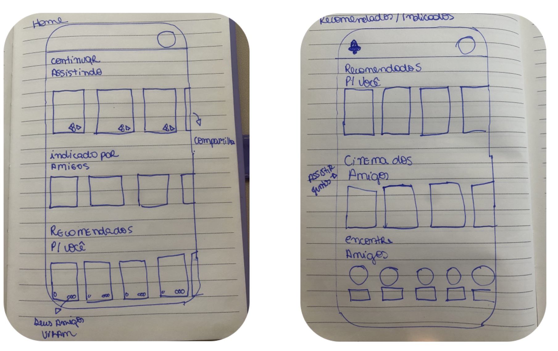
Before any pixel: the home reorganised around where you stopped and what friends indicated, and a second screen for the recommendations themselves — where “Cinema dos Amigos”, “Encontre Amigos” and “Assistir junto” first show up, in handwriting.
¶ Match de Recomendações
Discovery as a gesture instead of a search: one title at a time, always carrying the friend who indicated it — and swiping right jumps straight to the next indication.
Open “Recomenda aí”
See what your friends indicated
Swipe through one friend’s suggestions
Read why they recommended it
¶ Meli Watch Party
The second pillar — turning a session into something collective, live or scheduled.
Live sessions
- Pick a film or series and invite friends
- Everyone watches simultaneously, from anywhere
Integrated chat
- Comment the scenes as they happen
- React with emojis without leaving the player
Scheduled marathons
- Create a group to line up future sessions
- Set the date everyone watches together
¶ The prototype — navigable
The Meli Play flow running live inside this page — click through it just as you would in the app.
¶ Outcome
Friends’ indications
Discovery
a match, one title at a time
Watch party + chat
Session
Para você · Recomenda aí
Navigation
Qualitative signal
Concept work — the challenge ends at a prototype, not at a shipped metric. What it does establish is a mechanism: every surface gives the user a reason to return that involves somebody else.
Business impact
Framed as a differentiator in a crowded streaming market — the audience is already inside the Mercado Livre app; what the concept adds is a reason for it to come back.
¶ Reflection
What I'd do differently
The brief said “more social”, and the tempting answer is always a feed. The benchmarks are what kept me honest: Spotify and Duolingo don’t grow engagement by adding a feed, they grow it by giving people something to do together. That reframed the work from “show what friends watched” to “make watching together possible”. The piece I’d most want in front of real users before anyone builds it is the match interaction itself.
Next case · 04 / 04
Open ↗ZAVA Viagens
travel with intention.
